Affi
Hector, Jake Karis and MiMi
Sound and considerate understanding of the technologies used in production of the video, for example in terms of set design quality and the use of FCP to create ‘earthquake’ effects.
There are evident links between creative decision making and use of technology on both productions of the video using professional digital cameras and in the post production editing process – in discussion of match of action, lip syncing and graphic matching – in glitch effects and blinder lights in production. This is sustained and thorough and accurate in discussion of the branded themes of the MV of urbanism and a social realist feel.
The commentary shows a discrete awareness of the use of new media technology and uses discriminating examples really well, particularly to selection and construction of narrative, using masks and editing techniques, such as cross cutting and the pacing used. Excellent command of terminology and well presented – understands and discusses convergence really well if implied in the commentary.
There is sustained justified decision making links between the technologies used the product and audience reception in terms of the Grime genre. Recognises the need to account for errors in the post production stage.
This is a well considered documentary, well done and Well presented work.
MIMI JEFFRIES. Advanced & Foundation Production.
Friday, 10 February 2012
Directors feedback on how we used new media technologies
This video above discusses how as a group we used new media technologies in the construction, research, planning and evaluation stages.
what we didn't discuss in the video was the use of Photoshop and the design of our CD digipak and music poster. I will be discussing this below in detail.
Firstly we used Mac technology software, final cut pro in order to edit the video, this consisted of selecting and arranging various clips we had shot. We used final cut pro in order to edit the shots to cut to the beat of the music track. http://www.apple.com/finalcutpro/top-features/
Although a more important tool we used for our posters and digipaks was photoshop.
Using photoshop enabled us to manipulate images and graphic design. By working in layers and using digital tools, it allowed us to dramatically transform images into posters and digipaks. We used photoshop as it allowed us to be creative designers, as we could revise our photos, edit images, use layers and enhance quality and definition. Also the use of colours and filters enabled us to play around to find the correct balance of excitement relevant to our artist. We wanted to create a digipak and poster that would be bold and Bright, and not only give a statement but send the message across of where Affie belongs in his inner city world. As you can clearly see with our promotional poster, we played around with using black and white, all over but then contrasting the headliens and titles with a bold Font in order for them to stand out. We added climpses of colour by the recording company, and introducing new media technologies such as facebook, twitter etc.
http://en.wikipedia.org/wiki/Adobe_Photoshop
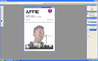
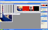
 Here is a print screen of me editing my promotional poster, we cleverly used photoshop which allowed us to edit images and use layers in order to build up a final design. Although it was a time consuming project, it required effort and precision as before we started editing we had to come up with designs which would attract customers and our target audience. We changed our idea from using colour to changing our design completely and doing a black and white theme throughout. Although we added colour through icons and symbols such as the facebook and twitter logo. In order for our target audience to connect to Affie and find out more about him daily and accessibly. I feel that our promotional poster still needs a lot of work done as it dosen't feel creative or professional enough. Thats why as a group we will sit down and adjust the design elements before we finalize it. I feel it is too empty and needs something else going on, possibly to fill the white background spaces.
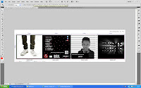
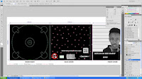 As well as our poster, we also used photoshop in order to create our digipak, this was a more challenging task as there were four panels rather than one. And each panel had to be different and link back to the music video itself or have some contextual meaning behind it, which would leave the audience questioning the artist himself. Here are some print screens of the process we took into making the Digipak. We choose four different pictures, one was the blinder lights which created a mysterious silhouette, another was the starcloth we used in order to potray affies in his own world, possibly space or somewhere no one else knows.
 The front panel of Affie in prison, is the mug shot this was very difficult to accomplish and required many layers on photoshop. We also added effects to the picture of Affie and adjusted the contrast and exposure of the pictures in order for them to stand out and be obvious to the target market.
 At this stage of my Alevel course, i feel i have used a more advanced level of photoshop than i did last year, with my as course, this was due to using more buttons than the basic ones in order to produce a higher standard digipak.
Wednesday, 8 February 2012
Evaluation task 4- pre production
Media technology played a very important part of all process within my media production, particular in pre production. In digital video, photography, television and film, pre-production refers to the tasks that must be completed or executed before filming or shooting begins. This includes tasks such as hiring actors or models, building sets, budgeting, planning, scheduling, renting equipment and tests, to name a few of the many pre-production tasks.
http://www.webopedia.com/TERM/P/pre_production.html
At this stage of the process, we were researching and considering possible genres we wanted to take on, having used the search engine google, we researched the grime genre and grime artists, which we could possibly use.
Firstly wikipedia, a very famous online enclopedia gives the defniition of grime as- Grime is a style of music that emerged from Bow, East London, England in the early 2000s, primarily as a development of UK garage, dancehall, and hip hop. Pioneers of the style include Dizzee Rascal, Wiley, and Roll Deep.
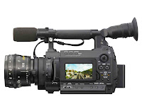 For our tests shoots, which we called prelims, we used the Hardware of Sony cameras F3 to shoot the footage we wanted. With these Sony cameras we shot our animatics too, we shot storyboards on camera in order to bring the planning to life.
Other pieces of equipment we used was mobile phone cameras, in order to cast the actors for our music video, we took photos of them and uploaded them to our blog. It was a quick and effective way to capture pictures of our actors. Once we had all the footage we then used the software Final cut pro in order to edit our simple footage.
http://www.sony.co.uk/biz/product/xdcamcamcorders/pmw-f3k/overview
One of the difficulties we faced was in fact finding the music track, we needed a specific digital file (WAV) audio file. We needed this a specific audio file to use not only for post production but also for the shoot day, so we could shoot in time to the song. Having done plenty of research on the internet we had difficulties finding the digitalised wav file, so we thought of emailing Mikill pane himself and asking, we emailed him but got no reply. We just used an ordinary music file which was a little distorted but it worked well, and produced a good enough sound.
http://www.webopedia.com/TERM/P/pre_production.html
At this stage of the process, we were researching and considering possible genres we wanted to take on, having used the search engine google, we researched the grime genre and grime artists, which we could possibly use.
Firstly wikipedia, a very famous online enclopedia gives the defniition of grime as- Grime is a style of music that emerged from Bow, East London, England in the early 2000s, primarily as a development of UK garage, dancehall, and hip hop. Pioneers of the style include Dizzee Rascal, Wiley, and Roll Deep.
Other websites included- http://www.nohatsnohoods.bigcartel.com/
no hats no hoods, was our final grime record company. The reason why we chose this company was due to its reputation and brand image.It has been said that, No Hats No Hoods is the UK’s leading Grime label. Created in 2007 when Grime releases on 12” were few and far between and the market was flooded with mixtapes, No Hats No Hoods set out to bring back vinyl culture to the scene. The label was born out of also the only regular club night in the grime music at the time, Dirty Canvas.
In order to display my research we used E-Blogger, this online tool helped me publish dynamic and creative peices of work. Within my blog, i dicuss my personal interpretations and thoughts of i used new media technologies in order to construct, reserch and plan ideas for our music video. Blogger has a creative format which can meet anybodys needs, as can be redesigned and you can upload work from powerpoint, slideshare, word, prezi etc.
 For our tests shoots, which we called prelims, we used the Hardware of Sony cameras F3 to shoot the footage we wanted. With these Sony cameras we shot our animatics too, we shot storyboards on camera in order to bring the planning to life.
Other pieces of equipment we used was mobile phone cameras, in order to cast the actors for our music video, we took photos of them and uploaded them to our blog. It was a quick and effective way to capture pictures of our actors. Once we had all the footage we then used the software Final cut pro in order to edit our simple footage.
http://www.sony.co.uk/biz/product/xdcamcamcorders/pmw-f3k/overview
One of the difficulties we faced was in fact finding the music track, we needed a specific digital file (WAV) audio file. We needed this a specific audio file to use not only for post production but also for the shoot day, so we could shoot in time to the song. Having done plenty of research on the internet we had difficulties finding the digitalised wav file, so we thought of emailing Mikill pane himself and asking, we emailed him but got no reply. We just used an ordinary music file which was a little distorted but it worked well, and produced a good enough sound.
Monday, 23 January 2012
Task 3- What have you learnt from your audience feedback?
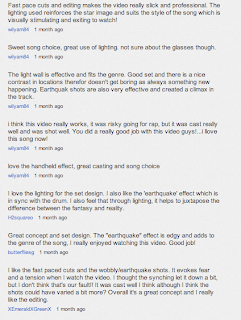 Having published our final product on you tube, we achieved a lot of positive and constructive feedback. The reason we chose you tube, was because it's a free video sharing tool, interlinking social networking sites with society. Here is a screen shot of some of the feedback we received, overall we received а lot of facebook on the editing and use of shots, as well as our powerful lighting such as having used blinder lights and the starcloth as well.
In order to receive feedback, we used a variety of approaches in order to receive a variety of information, this ranged from Focus groups to personal questionnaires.
Focus group- A focus group is a form of qualitative research in which a group of people are asked about their perceptions, opinions, beliefs and attitudes towards a product, service, concept, advertisement, idea, or packaging. Questions are asked in an interactive group setting where participants are free to talk with other group members. http://en.wikipedia.org/wiki/Focus_group%20
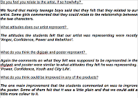
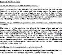 Having looked at our audience feedback, it is evident to say that we can base the audience readings from the narrative within the video. Narration is concerned with how an event is presented; as a group we decided for our music video to be more performance based than narrative based and therefore we rationed the information an audience requires, generating curiosity amongst the readers. I decided that the beginning, middle and end are not contained in an individual scene, instead they're created by the relation ship between different elements. Such as my character Affie and the mysterious, anonymous girl. These are essential parts of a narrative, as its the part which provides the most vital information, allowing our audience to construct meaning and form their own interpretations. This was evidently shown, through a range of readings and interpretations which connotes that various people within the same target market can have preferred readings open to questions, which differ from other people in the same target market.
  Its fair my music video 'Party Animal' contains narrative and it also provides a structure of meaning, an organising principal for audience to decode the text ( music video) and form personal opinions and judgements.
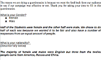 Theorists such as Roland Barthes claims that a narrative can be broken down into 5 codes/rules. The codes direct the reader into making sense of the story, helping our audience form there opinions and interpretations. There are many reasons for these codes, firstly texts are polysemic, meaning they are open to many different varieties of interpretations by the audience.

 Having looked at our audience feedback, it is evident to say that we can base the audience readings from the narrative within the video. Narration is concerned with how an event is presented; as a group we decided for our music video to be more performance based than narrative based and therefore we rationed the information an audience requires, generating curiosity amongst the readers. I decided that the beginning, middle and end are not contained in an individual scene, instead they're created by the relation ship between different elements. Such as my character Affie and the mysterious, anonymous girl. These are essential parts of a narrative, as its the part which provides the most vital information, allowing our audience to construct meaning and form their own interpretations. This was evidently shown, through a range of readings and interpretations which connotes that various people within the same target market can have preferred readings open to questions, which differ from other people in the same target market.
  Its fair my music video 'Party Animal' contains narrative and it also provides a structure of meaning, an organising principal for audience to decode the text ( music video) and form personal opinions and judgements.
 Theorists such as Roland Barthes claims that a narrative can be broken down into 5 codes/rules. The codes direct the reader into making sense of the story, helping our audience form there opinions and interpretations. There are many reasons for these codes, firstly texts are polysemic, meaning they are open to many different varieties of interpretations by the audience.
 Overall i have learnt that our finished products were aimed at a niche market and range from 18- 28 years old. Our market is niche because the genre of Grime music is not as popular as genres such as pop. Therefore by targeting a niche market we are advertising the genre to an audience that we know will enjoy the music. Because an audience has already been built after Dizzee Rascal and Wiley brought the grime genre to the mainstream audience between 2003- 2004 we know that we have an existing audience. Although it was brought to the attention of the mainstream media Grime / dance is still considered as ‘Underground Music’.
On the Jictar scale our target audience is under the categories of-
A- higher management/administration/professional
B-middle management/administration/professional.
C1-supervisory/clerical/Junior management.
We would use a physiographic segmentation- under the teenage VALS (various attitudes, values, beliefs and lifestyle choices). Our target audience would be categorised as-:
- rebels
-trendies
-drop-outs
-innovators
We believe our target audience would be from a black, urban, working class community.The most important thing that i learnt from our audience feedback was that each individual had interpreted the narrative in a different way, it was evident that our music video was more performance based although people admitted they were confused with the whole narrative, and that is due to the fact that we left the music video on a 'Cliffhanger', a device television dramas and soaps use in order to keep the audience on there toes and leave them intrigued and demanding to watch the next episode, keeping there interested. This technique was used in my music video in order to allow our target audience to interpret how they wanted to. Mainly due to the fact that our text is polysemic, and open to interpretation, preferred reading is very relevant as it is down to the individual and there opinions. Although on the other hand, my group challenged typical stereotypes of black, urban rappers against societies views, we created Affie who is representing a godly figure, looking down onto the mysterious, anonymous girl caring for her, allowing her to step out of her shell, and stop being a recluse. This challenged the audience as usually black, urban grime artists are considered to be dangerous, hard and tough, this changed as Affie yes has a very strong stage presence although this juxtaposes due to the worldly, concerning issues he sings about, out to the audience.
Underneath is a focus group of our target audience being intereviewed for there opinions and the aspects they struggled to understand or liked-
Saturday, 21 January 2012
Feedback
You make many good points in your presentation which I feel is an excellent address of the evaluation task. In particular you bring together many points in relation to the campaign and the marketing mix that you want to create, with suggested areas of development. there are one or two things that you need to do to ensure that the evaluation fully meets level four criteria. First check your spelling in the slides as errors are evident. I do feel that you need to revise who the target audience for your campaign, an 18 year old has very different tastes to a 28 year old. It might be better if you argued that you had a primary and secondary market with different if similar sets of VALS. Also try to use Dyer's arguments on the star image and you have created a brand identity for your artist. I am not sure if grime is a feature I would expect to see in NME magazine. Can you please blog evaluation task one.
Thank you, well done an excellent effort.
Thank you, well done an excellent effort.
Friday, 20 January 2012
Wednesday, 18 January 2012
Task 1
In order to complete task one, we thought it was appropriate to create a PowerPoint. We chose stills from our video, two panels from out digipak cover and our promotional poster to discuss. These stills are clearly shown in the PowerPoint with some text which explains how it illustrated our choices in using or challenging exisiting forms and conventions of music marketing.
Tuesday, 17 January 2012
Wednesday, 30 November 2011
Final poster and digipak
Having completed our Digipak and magazine advertisement, I can now evaluate the journey it took to create these. In order to create these, we used the software of Photoshop, this was a difficult process due to the fact it was time consuming as I had forgotten how this programme worked, so needed some additional help on how it simply works. Due to the fact we only had photos of the set throughout the shoot day, we had to organize a photo shoot in order to take some pictures of our main guy Affie. These photos were taken in the photography suite against a white backdrop in order to make these easier when we used them for editing.
 Using various angels and positions we took a couple of photos of Affie. It was important for Affie to be comfortable and be in his own clothes, to promote the fact that he isn’t all for show, he’s a singer whose relaxed and comfortable with his place in society. If I could compare him to other artists in society I would compare him to; ‘RZA, WU TANG and UGOD’, these artists portray similar characteristics within the hip hop world. Although I don’t think its right to compare Mikill pane to other artists, as he is individual in his own way and attracts and targets different types of audiences.
 Having uploaded these photos to the computer, it was then time for us to select the best photos out of the lot. Karis and I brainstormed various ideas, which we could use and came up with the convict idea of Affie against a height chart they use in prison, when mug shots were taken. Originally this was our first idea, but somehow we had to link it in with the whole concept of our media shoot.
We came up the idea that Affie is portrayed as a badman who actually deep down is a caring guy who questions a lot of elements in life, some of his lyrics were ‘tell me the truth’, ‘do you really want to destroy the movement’ and ‘I guess this never really matter’. All these statements, tell us that Mikill pane is infact a concerned guy that cares about society, although very much involved in his genre of ‘grime’. Grime artists are portrayed as gangsters who have low attitudes on life, but Affie is juxtaposing against this stereotype.
There are many features we had to include onto our digipak, this consisted of barcodes, recycling signs, copyright and special edition stickers. All these factors contribute to making the digipak look more realistic. We also incorperated a blackberry messenger barcode and website which is to display that we are using the latest technology in order to promote this artist and album. Allowing fans to access more information about Affie himself online. It was also important to come up with a list of song names which would also be on the back on the digipak, this was another factor that we had to incorperated into the design, as all artists display other songs. The record company we finally went with was ‘no hats no hoods’; this was a grime record company, which we felt matched our artist the best. We also used their logo onto our digipak and promotional poster as we felt it was necessary to advertise the record company Affie was part off.
Below is a detailed analysis of the process I went throughout in order to make the digipak and promotional poster, it shows screenshots of using Photoshop, logos and images that I used in order to complete these tasks. Our album title is ‘Return of the flat top’ which gives the audience an impression of the late 80’s and 90’s. Which is also a sense in changing of time. We are linking in the old with the new, such as the linking old school hip-hop with the genre of grime. In order to promote the idea of ‘Return of the flattop’ we have used Affies hairstyle in order to generate this point of view. It ties in with the album appropriately, which connects the album name to the character himself. The fact one of the backgrounds was star cloth, was to also introduce factors of the shoot day of ‘Party animal’, it also intertwines with the fact Affie is in his own world, possibly supporting the idea that Affie is special in his own ways and has abnormal powers, hidden underneath him. This also could be seen as the fans he has, which look up to him and see him as a superhero figure.
I believe so far we have produced a very successful digipak, which will only be improved as our process id developed.
Saturday, 26 November 2011
Feedback
Excellent posts - well done, fully reflective on the production process!
Thursday, 24 November 2011
Process on promotional music poster
Having done a lot of planning and preparation for our poster, within our group we all came up with ideas which we could link together. Jake designed a poster as part of our planning- this poster was based on our music video shoot, using the pictures which had been taken throughout. Jakes idea was to use a simplistic approach, although this was just a rough idea.
In this poster you can see that this shot was taken upwards, to emphasize Affie is seen as a hero and a god like figure. The colour's Jake used stand out, therefore attracting the audiences attention and possibly allowing the audience to remember the artists name or any additional information about the artist.
From then on, Karis and i started our own poster using the photos we took from a photo shoot in the photography labs, these photos were against a white backdrop, model lights and flash lights. These lights were used in order to add to the ambiance and create more professional photos.
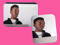 These two pictures we used are very similar although catch the glimpse of Affie looking into the future and possibly trying to imagine the return of the flatcap. In this picture you can see Affie against the white baackdrop, this also makes it easier for us to edit and add additional effects.
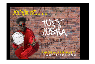
Part of our design process, we researched names which could tag along with our artists name Affie. We wanted a catchy phrase which we could give a twist to in order to attract audiences. Due to our genre being a grime track, we wanted to add a RnB/Grime feel to them. Some of the ones we came up with or generated on websites were-
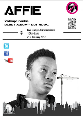
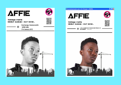 So far we are in the editing process for our promotional process, using photoshop. So far Karis and i have designed this poster, one of them is in black and white, other one is in colour, this is all part of our planning and preperation. We have included a bbm barcode as we believe it is very important to use modern day technology, which all sorts of audiences can realte to. Also we have used the logo of our record company, 'No hats no Hoods', this is a grime record label which we believe is appropriate to add.Choosing the font, is difficult as there are so many, although we decided we wanted to use an artistic font which would attract the audience but still be modern.
On this poster, we will have the name of the debut album- "Voltage mafia", we believe this name is a powerful album name which gives an electrifying idea.
voltage- we thought of this due to the powers Affie has as heroic symbol, also the star cloth and other lighting we used relate to voltage.
mafia- stereotypically we think of the mafia as an organized international body of criminal, although as a group we are juxtaposing this idea as Affie looks criminal although he is a one man show, and an innocent, honest guy in society. Just follows the grime appearance which people may associate with crime.
http://en.wikipedia.org/wiki/Mafia?redirect=no
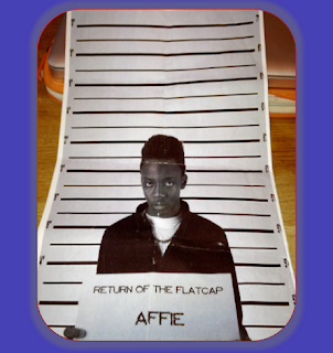 Following the crime idea, Karis and i had another design idea, this would possibly be for the promotional poster or for the Digipak, going to the editing suite, we managed to photo shop a mugshot with Affie.
This is how it looked->
Although in the end we felt it would confuse our target market, as we are trying to portray that Affie isn't a criminal, or a bad guy, although in this case it clearly looks like he is. In order to change peoples views we would have to create a strong enough argument. This idea we are still keeping aside, as we believe it may become useful when designing our digipak.
In this poster you can see that this shot was taken upwards, to emphasize Affie is seen as a hero and a god like figure. The colour's Jake used stand out, therefore attracting the audiences attention and possibly allowing the audience to remember the artists name or any additional information about the artist.
From then on, Karis and i started our own poster using the photos we took from a photo shoot in the photography labs, these photos were against a white backdrop, model lights and flash lights. These lights were used in order to add to the ambiance and create more professional photos.
 These two pictures we used are very similar although catch the glimpse of Affie looking into the future and possibly trying to imagine the return of the flatcap. In this picture you can see Affie against the white baackdrop, this also makes it easier for us to edit and add additional effects.
Part of our design process, we researched names which could tag along with our artists name Affie. We wanted a catchy phrase which we could give a twist to in order to attract audiences. Due to our genre being a grime track, we wanted to add a RnB/Grime feel to them. Some of the ones we came up with or generated on websites were-
1) Affie - A safe place in an unsafe world!
2) Don't play with fire!? Play with Affie!
3) See the world with Affie
4) Semper affie
5) Don’t just book it, Affie it.
6) Khaki voltage
7) Eazy luv
8) Fresh flava
 So far we are in the editing process for our promotional process, using photoshop. So far Karis and i have designed this poster, one of them is in black and white, other one is in colour, this is all part of our planning and preperation. We have included a bbm barcode as we believe it is very important to use modern day technology, which all sorts of audiences can realte to. Also we have used the logo of our record company, 'No hats no Hoods', this is a grime record label which we believe is appropriate to add.
On this poster, we will have the name of the debut album- "Voltage mafia", we believe this name is a powerful album name which gives an electrifying idea.
voltage- we thought of this due to the powers Affie has as heroic symbol, also the star cloth and other lighting we used relate to voltage.
mafia- stereotypically we think of the mafia as an organized international body of criminal, although as a group we are juxtaposing this idea as Affie looks criminal although he is a one man show, and an innocent, honest guy in society. Just follows the grime appearance which people may associate with crime.
http://en.wikipedia.org/wiki/Mafia?redirect=no
 Following the crime idea, Karis and i had another design idea, this would possibly be for the promotional poster or for the Digipak, going to the editing suite, we managed to photo shop a mugshot with Affie.
This is how it looked->
Although in the end we felt it would confuse our target market, as we are trying to portray that Affie isn't a criminal, or a bad guy, although in this case it clearly looks like he is. In order to change peoples views we would have to create a strong enough argument. This idea we are still keeping aside, as we believe it may become useful when designing our digipak.
Digipak and poster process.
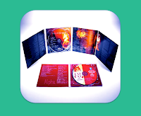 A digipak is- a patented style of CD, DVD or BD packaging. Digipacks are a type of CD packaging made out of card stock or other heavy paper/cardboard material. Digipacks can flip open like a book, or it can have three parts, so that one portion of the packaging opens to the right and one to the left, with the CD in the center portion. Usually, the portion of the digipack that hold the CD is made of plastic like a traditional jewel case CD - the plastic part is simply attached to the paper background.
http://en.wikipedia.org/wiki/Digipak
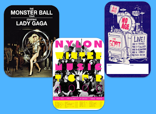 A promotional poster- a promotional poster is a a4 sized poster which will be featured in a music magazine such as NME, Q, THE ROLLING STONE ETC. This poster will advertise and promote the band, tour dates, website and sell the brand image. It is a promotional tool, which is used by record companies in order to globally let society know about this various band. Many examples which we liked was firstly the record company were using, one reason for this is because it is a grime record label, fixing in with our genre of grime.
 http://www.nohatsnohoods.bigcartel.com/
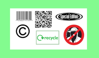 For our Digipak and promotional poster i firstly researched all logos and aspects which i would like to feature on my digipak and poster. I used the Internet tool "google" in order to find the logos and pictures i wanted to use- these were. This picture is the logo i used, it includes bar codes, bbm bar codes, special edition sticker, a recycle sticker in order to fit in with the environmental scheme, the copyright logo to follow the laws. And the last logo is our record label logo.
Adding to our digipak on the back cover, we came up with a list of songs whilst designing our digipak. The list of tracks, included 'Party animal remix'.
Track songs.
1) Party animal
2) The hood
3) Let me
4) Grindim
5) Kill the Dj
6) Say it
7) Warning
8) Sell me candy
9) Jump
10) Knockout
11)Up out my face
12) Getting past
This picture above is the starting process of creating our digipak, we are using Photoshop and a Digipak template, which gives us a starting point. As a group we would like our Digipak to follow the artistic route, although not be overcomplicated, simple at the same time. We have a lot of ideas up our sleves and as a group have finalized one idea, which are in the Middle of processing.
Monday, 21 November 2011
Health and Saftey
Definition- “Organized efforts and procedures for identifying workplace hazards and reducing accidents and exposure to harmful situations and substances. It also includes training of personnel in accident prevention, accident response, emergency preparedness, and use of protective clothing and equipment.”
Health and safety in the studio was a vital aspect we needed to take into consideration, not only for our crew but the cast as well. This was due to the fact we had the responsibility of them for the day. One of the main hazards was the potential risk of fire, we were using a lot of smoke and due to being in an enclosed space we had the risk of the fire alarms going of if the fire doors weren’t shut correctly.
Another issue was smoking; this was prohibited by the studio as it was a potential fire hazard. Throughout our shoot day we had no complications with these fire hazards. Although there were others, we used a dolly in order to use a tracking device and this was a potential hazard as the camera man is pushed around sometimes at a fast pace and a third person has to wind up the wires in order for no one to trip up and hurt themselves. There was nothing obviously dangers on our set or in the studio. There were a few props hanging around which could have been in the way and a potential risk, due to the fact it was so dark and there were hardly any lights. But apart from that we had a safe shoot day.
Saturday, 19 November 2011
Feedback
Excellent! Next is to complete the CD digipack and get this posted. Only one are for development is linking production to the construction of the star image via the look or mise en scene of the video - how well do you think this went?
Wednesday, 16 November 2011
Our roles within this pop video.
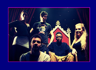 Our group is made up of four people, and we fairly distributed roles to each member of our ensemble.
 It was important as to distribute jobs across the day as part of being an organized team. Working together or seperately was very important as every help contributed to the overall process.
Here the picture features us as a team, Karis, Jake, Hector and Emilia. Aswell as Affie in his chair, being the centre focus.Over the course of our shoot day, I was given the role of a Director. "A film director is a person who directs the actors and film crew in filmmaking.They control a film's artistic and dramatic aspects, while guiding the technical crew and actors". http://en.wikipedia.org/wiki/Film_director . I really enjoyed this role due to being able to take charge of the crew and directing to the camera man (Hector) which shots worked and which didnt, as a role of a director i also wrote a detailed anaylisis of the certain shots we took, if they were good or not, the type of shot we did and diagrams as well. Being the director i had to keep the group alert, up to date with changes which may have occured throughout the day and also we couldnt be too relaxed and laid back throughout the day otherwise our work would have been sloppy and messy. I felt i was a good director and team leader, through my organizational and directing skills. I felt the group was kept tightly together throughout the day, even in Guildford and we had a succcessful shoot day.
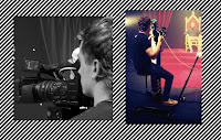 Hector main role was camera man, although other peple in our group each had a turn on the camera, Hector did a very good job, he was able to white balance, focus and use saturation on the camera. Hector also got the opportunity to use the dolly, this specialised peice of equipment we were lucky to be able to use and it was a very vital peice of equipment for our group.
  Karis also contributed to this, when i was helping out with the dolly, she took over my role as director for a few minutes. Karis mainly focused on playback, this was an important role as she had to manage when to play the track, pause and go back to the beginning, this was vital and she had to be on the ball, all the time.
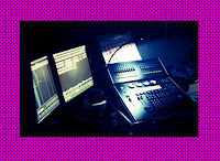
 Jake was mainly incharge of the lighting desk, he controlled the monitors and was able to adjust the various lights we had installed and positioned in the studio. Jake had to be careful especially when using the blinders due to when the exposrue was put up to much, the only thing that came out on camera was a white screen, so the picture was lost. But we resolved this problem when we could look at the monitor and adjust the buttons at the lighting panel in order to achieve the best light.
Subscribe to:
Comments (Atom)


