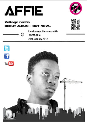
Having completed our Digipak and magazine advertisement, I can now evaluate the journey it took to create these. In order to create these, we used the software of Photoshop, this was a difficult process due to the fact it was time consuming as I had forgotten how this programme worked, so needed some additional help on how it simply works. Due to the fact we only had photos of the set throughout the shoot day, we had to organize a photo shoot in order to take some pictures of our main guy Affie. These photos were taken in the photography suite against a white backdrop in order to make these easier when we used them for editing.
 Using various angels and positions we took a couple of photos of Affie. It was important for Affie to be comfortable and be in his own clothes, to promote the fact that he isn’t all for show, he’s a singer whose relaxed and comfortable with his place in society. If I could compare him to other artists in society I would compare him to; ‘RZA, WU TANG and UGOD’, these artists portray similar characteristics within the hip hop world. Although I don’t think its right to compare Mikill pane to other artists, as he is individual in his own way and attracts and targets different types of audiences.
 Having uploaded these photos to the computer, it was then time for us to select the best photos out of the lot. Karis and I brainstormed various ideas, which we could use and came up with the convict idea of Affie against a height chart they use in prison, when mug shots were taken. Originally this was our first idea, but somehow we had to link it in with the whole concept of our media shoot.
We came up the idea that Affie is portrayed as a badman who actually deep down is a caring guy who questions a lot of elements in life, some of his lyrics were ‘tell me the truth’, ‘do you really want to destroy the movement’ and ‘I guess this never really matter’. All these statements, tell us that Mikill pane is infact a concerned guy that cares about society, although very much involved in his genre of ‘grime’. Grime artists are portrayed as gangsters who have low attitudes on life, but Affie is juxtaposing against this stereotype.
There are many features we had to include onto our digipak, this consisted of barcodes, recycling signs, copyright and special edition stickers. All these factors contribute to making the digipak look more realistic. We also incorperated a blackberry messenger barcode and website which is to display that we are using the latest technology in order to promote this artist and album. Allowing fans to access more information about Affie himself online. It was also important to come up with a list of song names which would also be on the back on the digipak, this was another factor that we had to incorperated into the design, as all artists display other songs. The record company we finally went with was ‘no hats no hoods’; this was a grime record company, which we felt matched our artist the best. We also used their logo onto our digipak and promotional poster as we felt it was necessary to advertise the record company Affie was part off.
Below is a detailed analysis of the process I went throughout in order to make the digipak and promotional poster, it shows screenshots of using Photoshop, logos and images that I used in order to complete these tasks. Our album title is ‘Return of the flat top’ which gives the audience an impression of the late 80’s and 90’s. Which is also a sense in changing of time. We are linking in the old with the new, such as the linking old school hip-hop with the genre of grime. In order to promote the idea of ‘Return of the flattop’ we have used Affies hairstyle in order to generate this point of view. It ties in with the album appropriately, which connects the album name to the character himself. The fact one of the backgrounds was star cloth, was to also introduce factors of the shoot day of ‘Party animal’, it also intertwines with the fact Affie is in his own world, possibly supporting the idea that Affie is special in his own ways and has abnormal powers, hidden underneath him. This also could be seen as the fans he has, which look up to him and see him as a superhero figure.
I believe so far we have produced a very successful digipak, which will only be improved as our process id developed.

No comments:
Post a Comment