Having done a lot of planning and preparation for our poster, within our group we all came up with ideas which we could link together. Jake designed a poster as part of our planning- this poster was based on our music video shoot, using the pictures which had been taken throughout. Jakes idea was to use a simplistic approach, although this was just a rough idea.
In this poster you can see that this shot was taken upwards, to emphasize Affie is seen as a hero and a god like figure. The colour's Jake used stand out, therefore attracting the audiences attention and possibly allowing the audience to remember the artists name or any additional information about the artist.
From then on, Karis and i started our own poster using the photos we took from a photo shoot in the photography labs, these photos were against a white backdrop, model lights and flash lights. These lights were used in order to add to the ambiance and create more professional photos.
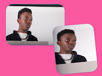 These two pictures we used are very similar although catch the glimpse of Affie looking into the future and possibly trying to imagine the return of the flatcap. In this picture you can see Affie against the white baackdrop, this also makes it easier for us to edit and add additional effects.
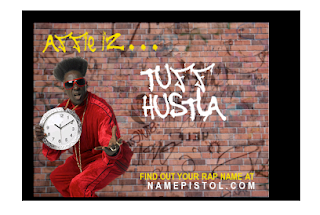
Part of our design process, we researched names which could tag along with our artists name Affie. We wanted a catchy phrase which we could give a twist to in order to attract audiences. Due to our genre being a grime track, we wanted to add a RnB/Grime feel to them. Some of the ones we came up with or generated on websites were-
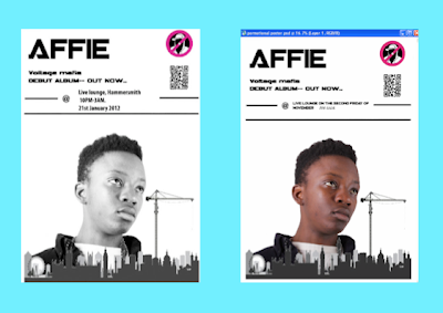 So far we are in the editing process for our promotional process, using photoshop. So far Karis and i have designed this poster, one of them is in black and white, other one is in colour, this is all part of our planning and preperation. We have included a bbm barcode as we believe it is very important to use modern day technology, which all sorts of audiences can realte to. Also we have used the logo of our record company, 'No hats no Hoods', this is a grime record label which we believe is appropriate to add.Choosing the font, is difficult as there are so many, although we decided we wanted to use an artistic font which would attract the audience but still be modern.
On this poster, we will have the name of the debut album- "Voltage mafia", we believe this name is a powerful album name which gives an electrifying idea.
voltage- we thought of this due to the powers Affie has as heroic symbol, also the star cloth and other lighting we used relate to voltage.
mafia- stereotypically we think of the mafia as an organized international body of criminal, although as a group we are juxtaposing this idea as Affie looks criminal although he is a one man show, and an innocent, honest guy in society. Just follows the grime appearance which people may associate with crime.
http://en.wikipedia.org/wiki/Mafia?redirect=no
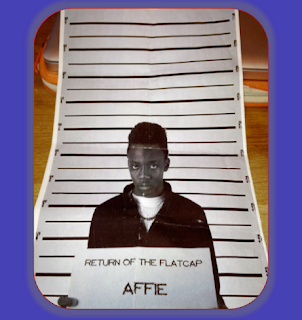 Following the crime idea, Karis and i had another design idea, this would possibly be for the promotional poster or for the Digipak, going to the editing suite, we managed to photo shop a mugshot with Affie.
This is how it looked->
Although in the end we felt it would confuse our target market, as we are trying to portray that Affie isn't a criminal, or a bad guy, although in this case it clearly looks like he is. In order to change peoples views we would have to create a strong enough argument. This idea we are still keeping aside, as we believe it may become useful when designing our digipak.
In this poster you can see that this shot was taken upwards, to emphasize Affie is seen as a hero and a god like figure. The colour's Jake used stand out, therefore attracting the audiences attention and possibly allowing the audience to remember the artists name or any additional information about the artist.
From then on, Karis and i started our own poster using the photos we took from a photo shoot in the photography labs, these photos were against a white backdrop, model lights and flash lights. These lights were used in order to add to the ambiance and create more professional photos.
 These two pictures we used are very similar although catch the glimpse of Affie looking into the future and possibly trying to imagine the return of the flatcap. In this picture you can see Affie against the white baackdrop, this also makes it easier for us to edit and add additional effects.
Part of our design process, we researched names which could tag along with our artists name Affie. We wanted a catchy phrase which we could give a twist to in order to attract audiences. Due to our genre being a grime track, we wanted to add a RnB/Grime feel to them. Some of the ones we came up with or generated on websites were-
1) Affie - A safe place in an unsafe world!
2) Don't play with fire!? Play with Affie!
3) See the world with Affie
4) Semper affie
5) Don’t just book it, Affie it.
6) Khaki voltage
7) Eazy luv
8) Fresh flava
 So far we are in the editing process for our promotional process, using photoshop. So far Karis and i have designed this poster, one of them is in black and white, other one is in colour, this is all part of our planning and preperation. We have included a bbm barcode as we believe it is very important to use modern day technology, which all sorts of audiences can realte to. Also we have used the logo of our record company, 'No hats no Hoods', this is a grime record label which we believe is appropriate to add.
On this poster, we will have the name of the debut album- "Voltage mafia", we believe this name is a powerful album name which gives an electrifying idea.
voltage- we thought of this due to the powers Affie has as heroic symbol, also the star cloth and other lighting we used relate to voltage.
mafia- stereotypically we think of the mafia as an organized international body of criminal, although as a group we are juxtaposing this idea as Affie looks criminal although he is a one man show, and an innocent, honest guy in society. Just follows the grime appearance which people may associate with crime.
http://en.wikipedia.org/wiki/Mafia?redirect=no
 Following the crime idea, Karis and i had another design idea, this would possibly be for the promotional poster or for the Digipak, going to the editing suite, we managed to photo shop a mugshot with Affie.
This is how it looked->
Although in the end we felt it would confuse our target market, as we are trying to portray that Affie isn't a criminal, or a bad guy, although in this case it clearly looks like he is. In order to change peoples views we would have to create a strong enough argument. This idea we are still keeping aside, as we believe it may become useful when designing our digipak.

No comments:
Post a Comment