This video above discusses how as a group we used new media technologies in the construction, research, planning and evaluation stages.
what we didn't discuss in the video was the use of Photoshop and the design of our CD digipak and music poster. I will be discussing this below in detail.
Firstly we used Mac technology software, final cut pro in order to edit the video, this consisted of selecting and arranging various clips we had shot. We used final cut pro in order to edit the shots to cut to the beat of the music track. http://www.apple.com/finalcutpro/top-features/
Although a more important tool we used for our posters and digipaks was photoshop.
Using photoshop enabled us to manipulate images and graphic design. By working in layers and using digital tools, it allowed us to dramatically transform images into posters and digipaks. We used photoshop as it allowed us to be creative designers, as we could revise our photos, edit images, use layers and enhance quality and definition. Also the use of colours and filters enabled us to play around to find the correct balance of excitement relevant to our artist. We wanted to create a digipak and poster that would be bold and Bright, and not only give a statement but send the message across of where Affie belongs in his inner city world. As you can clearly see with our promotional poster, we played around with using black and white, all over but then contrasting the headliens and titles with a bold Font in order for them to stand out. We added climpses of colour by the recording company, and introducing new media technologies such as facebook, twitter etc.
http://en.wikipedia.org/wiki/Adobe_Photoshop

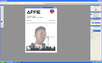
 Here is a print screen of me editing my promotional poster, we cleverly used photoshop which allowed us to edit images and use layers in order to build up a final design. Although it was a time consuming project, it required effort and precision as before we started editing we had to come up with designs which would attract customers and our target audience. We changed our idea from using colour to changing our design completely and doing a black and white theme throughout. Although we added colour through icons and symbols such as the facebook and twitter logo. In order for our target audience to connect to Affie and find out more about him daily and accessibly. I feel that our promotional poster still needs a lot of work done as it dosen't feel creative or professional enough. Thats why as a group we will sit down and adjust the design elements before we finalize it. I feel it is too empty and needs something else going on, possibly to fill the white background spaces.
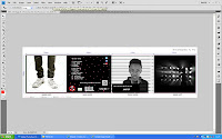
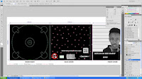
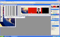
 As well as our poster, we also used photoshop in order to create our digipak, this was a more challenging task as there were four panels rather than one. And each panel had to be different and link back to the music video itself or have some contextual meaning behind it, which would leave the audience questioning the artist himself. Here are some print screens of the process we took into making the Digipak. We choose four different pictures, one was the blinder lights which created a mysterious silhouette, another was the starcloth we used in order to potray affies in his own world, possibly space or somewhere no one else knows.
 The front panel of Affie in prison, is the mug shot this was very difficult to accomplish and required many layers on photoshop. We also added effects to the picture of Affie and adjusted the contrast and exposure of the pictures in order for them to stand out and be obvious to the target market.
 At this stage of my Alevel course, i feel i have used a more advanced level of photoshop than i did last year, with my as course, this was due to using more buttons than the basic ones in order to produce a higher standard digipak.

No comments:
Post a Comment